09

Stovetop Studios

Stovetop Studios is an indie game development company that I’ve been creating in-game art assets, video trailers, and media visuals for. I’ve also conducted product testing, concept generation, and marketing tactics for the team. My content is used within their popular game Snakeybus, and has been featured on platforms such as Microsoft, Nintendo, Steam, Playstation, […]

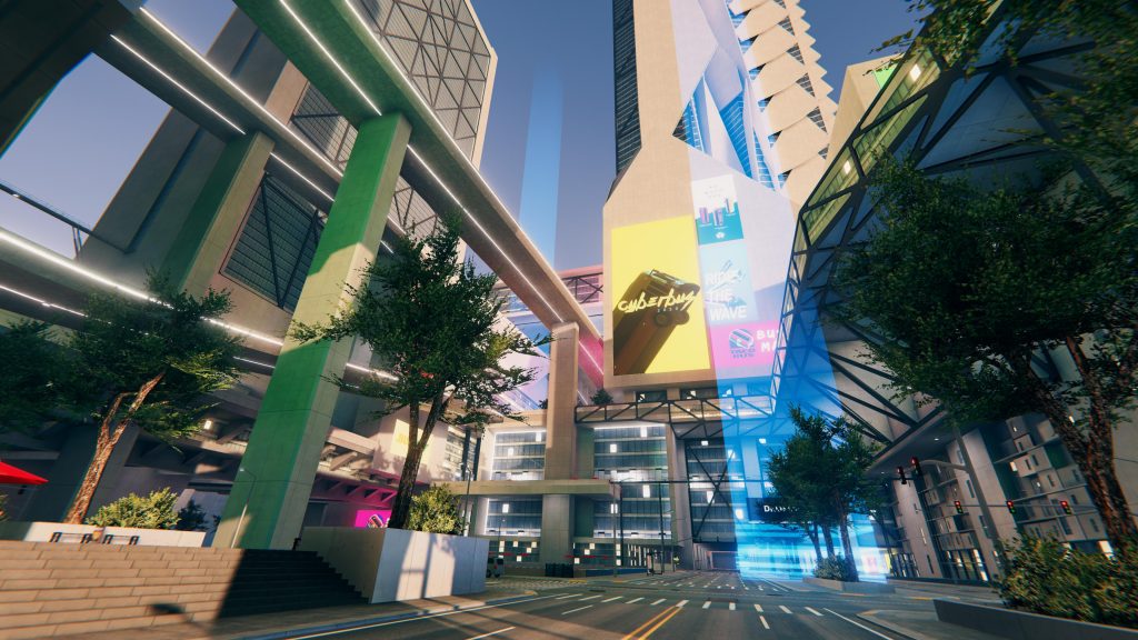
Stovetop Studios is an indie game development company that I’ve been creating in-game art assets, video trailers, and media visuals for. I’ve also conducted product testing, concept generation, and marketing tactics for the team. My content is used within their popular game Snakeybus, and has been featured on platforms such as Microsoft, Nintendo, Steam, Playstation, and Forbes.

08

iDigest

iDigest is a mobile and web application spearheaded by GraceTech as a response to the technical needs of non-profit organizations. The app primarily provides quality discussion guides for class content, but also functions as an interface for group study communications. The Challenge WeChat, the popular Chinese messaging and social media app, has been steadily increasing […]

iDigest is a mobile and web application spearheaded by GraceTech as a response to the technical needs of non-profit organizations. The app primarily provides quality discussion guides for class content, but also functions as an interface for group study communications.

The Challenge

WeChat, the popular Chinese messaging and social media app, has been steadily increasing its levels of censorship. Many organizations’ “Public Accounts” have been shut down due to posting content related to religious beliefs. Church organizations are now looking for alternatives, and our goal is to utilize iDigest’s current infrastructure and features to provide an effective solution.

Our high-level goals:

  1. Transform iDigest into a multi-organization, content-producing platform
  2. Develop features that appeal to all of our users: church members, organization leaders, content producers, and content-oriented users

My Role

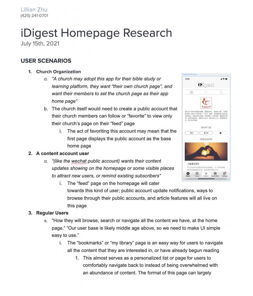
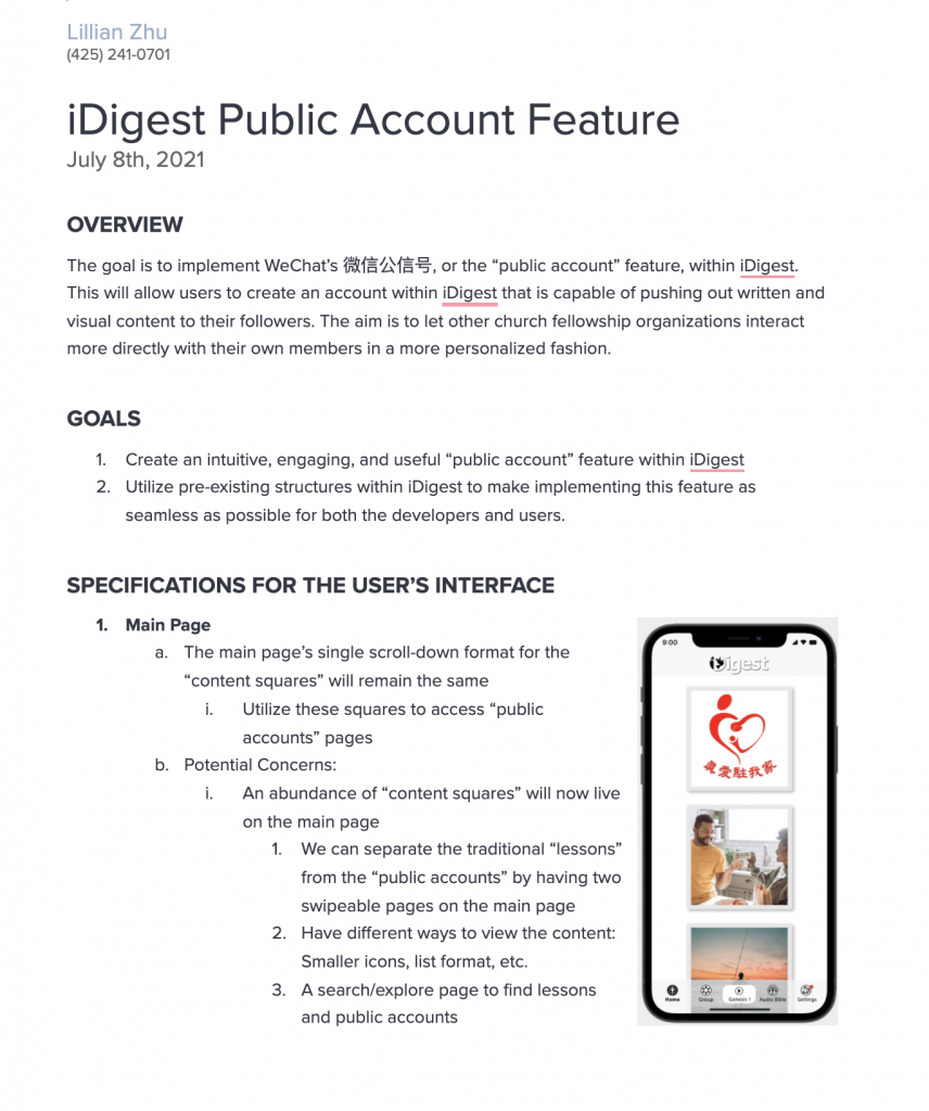
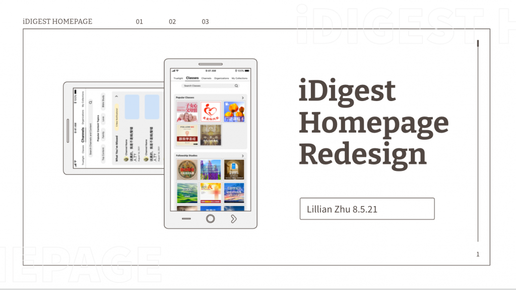
I was tasked with writing detailed feature specifications for implementing “Public Accounts” within iDigest, which involved restructuring the mobile app’s homepage. I worked alongside the team’s front-end developers and program manager.

Once my written specifications were approved, I crafted a wireframe mockup using Figma and Adobe XD to help visualize and convey our ideas. Specific UX decisions were made after consulting with our team’s UX researcher, ensuring that the new features are intuitive to use by our older audience, and simple to develop.

I then presented my homepage redesign pitch to the CEO and then began implementing some of the new ideas onto the web app using React.

By the end of my internship, we successfully presented a prototype of a “Public Account” within iDigest to our church organization client.

The Process

First step = Research

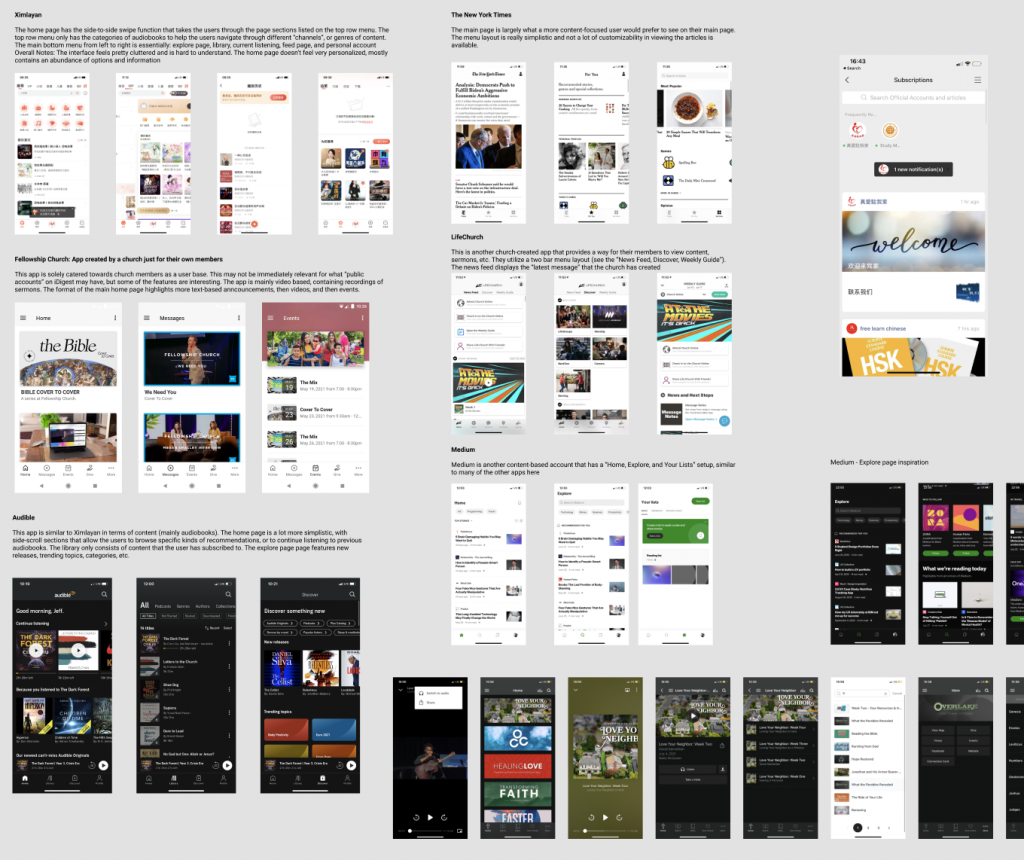
I conducted research within many other mobile applications that ranged from church-oriented content to news platforms like The New York Times. My goal was to piece together common features and page structures across a variety of different apps and audiences, so the new features within Digest’s new homepage could be easily used by an older audience.

Specification

I began fleshing out our ideas for the new homepage by

Scaffolding

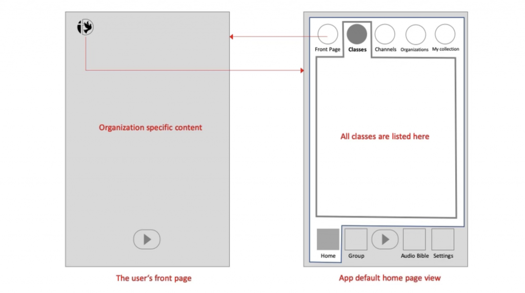
After discussion, we generated a basic homepage layout. This served as my foundation throughout the design process.

07

UW Formula Motorsports – Sponsorship Packet

Within UW Formula Motorsports, I’ve been given an exciting chance to practice and display my interests in graphic design and photography. As the administrative director for the team, I’m closely involved with crafting the team’s outward-facing image, and this translates to ensuring that our sponsorship documents, website, and general social media are all created with […]

Within UW Formula Motorsports, I’ve been given an exciting chance to practice and display my interests in graphic design and photography. As the administrative director for the team, I’m closely involved with crafting the team’s outward-facing image, and this translates to ensuring that our sponsorship documents, website, and general social media are all created with quality and meaning. 

06

QuipBot

Quip Bot is a Discord bot that implements a multiplayer game that takes inspiration from the popular party game “Quiplash”. I created this project with two other team members for our UW CSE 143 final project. We wanted to create QuipBot because we’ve all enjoyed playing similar online party games throughout quarantine. Also, as avid […]

Quip Bot is a Discord bot that implements a multiplayer game that takes inspiration from the popular party game “Quiplash”. I created this project with two other team members for our UW CSE 143 final project. We wanted to create QuipBot because we’ve all enjoyed playing similar online party games throughout quarantine. Also, as avid users of Discord, we thought that it would be a fun and rewarding experience creating a game within such a familiar, popular application. I focused on giving QuipBot its visual identity, creating the design of the game within Discord. I also designed the logo, graphics, and presentation.

QuipBot can be invited into any server as a bot, accessing the server’s input from multiple players, and displaying the game’s text-based output in a series of rounds. The bot will have voting mechanisms through emote reactions and keep track of player scores. Players can input their own prompts that the bot stores as a list. Pairs of players will then receive a random prompt that another player created, and respond to it in a witty manner. Once every player has responded, these pairs of players will have their responses shown simultaneously, then judged through other players’ message reaction emotes. The points are distributed accordingly, and the next round continues!

Since most of us use Discord ourselves, gaining a deeper understanding of a system that we casually use every day with our friends was definitely fulfilling and educational. During our learning and testing process, it was extremely fun making bots that could do entertaining, inside-joke-esque things within our friend groups. Making a program like a bot that could be instantly tangible and interactive was satisfying as well. Seeing our friends enjoy testing the game was a great feeling, and was extremely encouraging towards making progress and creating new features for our game bot. Additionally, coding and birthing a bot that works well with a team certainly created a strong bond between our group and will be a fond memory of our friendship in the future and beyond.

05

The Road

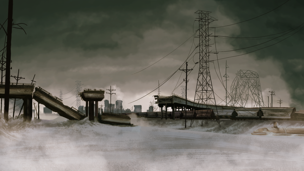
An AP Lang final project based on Cormac McCarthy’s The Road. This project was both my first time using Unity and my first time using a tablet to illustrate digitally. My goal was to gain some surface-level understanding of Unity in order to display my drawn work with a parallax effect. Throughout the process, I […]

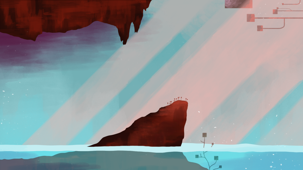
An AP Lang final project based on Cormac McCarthy’s The Road. This project was both my first time using Unity and my first time using a tablet to illustrate digitally. My goal was to gain some surface-level understanding of Unity in order to display my drawn work with a parallax effect. Throughout the process, I learned that I really enjoy drawing digitally on a tablet, and seeing my 2D work come to life was an exciting process.

Here’s a quick recording of my explanation to my English teacher:

04

UW Formula Technical Projects

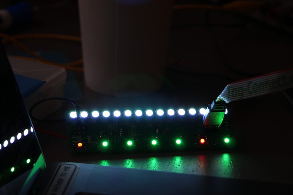
When I joined UW Formula’s firmware team, I was given two main projects: The D2C (Digital to CAN) boards and the dashboard. Throughout the year, I absorbed so much knowledge from my team members, ranging from technical to mechanical. As a computer science major joining the team, I only knew how to interact with electronics […]

When I joined UW Formula’s firmware team, I was given two main projects: The D2C (Digital to CAN) boards and the dashboard. Throughout the year, I absorbed so much knowledge from my team members, ranging from technical to mechanical. As a computer science major joining the team, I only knew how to interact with electronics at an extremely top level. I never anticipated that I would have learned the skills necessary to interact with PCBs so directly, along with creating wiring harnesses, interacting with inverter interfaces, and much more. The invaluable hands-on experience is something that I’m truly grateful for.

03

Harmony Visualizer

During DubHacks 2020, my team created our app, Harmony Visualizer, which provides users with a visual platform in which they can see how different notes can be harmonized in different keys. Our Goals We wanted to develop an effective virtual music education resource as there is a lack of online resources that are user-friendly and […]

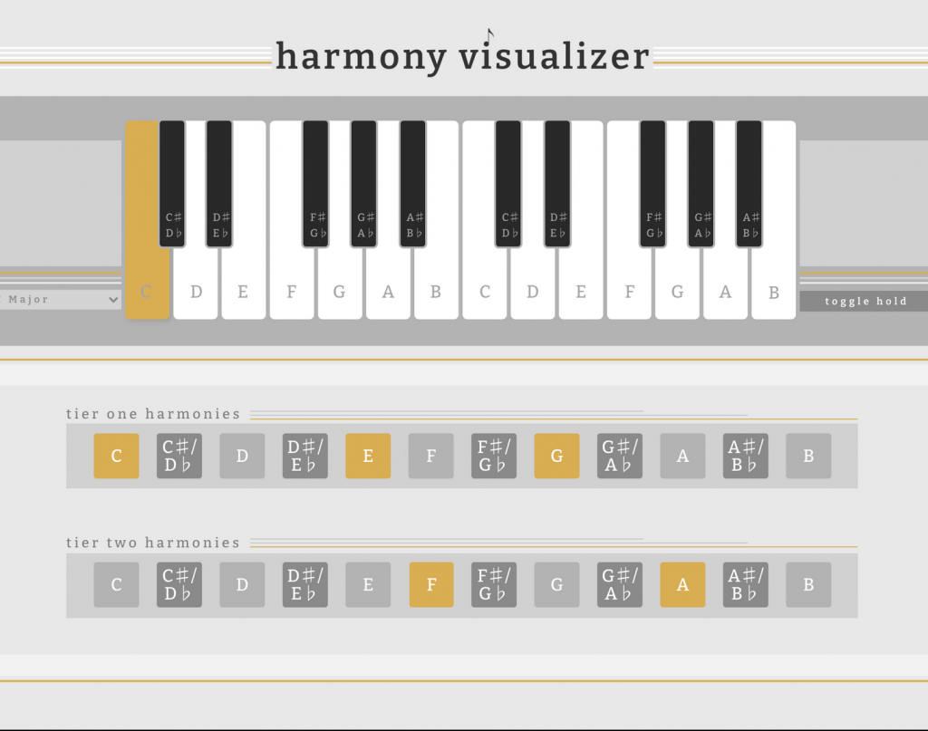
During DubHacks 2020, my team created our app, Harmony Visualizer, which provides users with a visual platform in which they can see how different notes can be harmonized in different keys.

Our Goals

We wanted to develop an effective virtual music education resource as there is a lack of online resources that are user-friendly and effective. We believed that it’s important for beginner musicians to have accessible and multimodal ways to learn music theory concepts, and having a combination of aural and visual feedback helps users to solidify these musical connections beyond the classroom. We also created this with the hope of having it be a useful quick reference for more experienced musicians.

The Challenge

As a group of four freshmen majoring in computer science, a lot of us had foundational Java knowledge gained from our high school classes and side projects. However, when faced with developing a web app within 48 hours, we decided to use Bubble as a low-code solution. The time constraint forced us to go through the design process rapidly and think on our feet.

My Contribution

I helped bring my team’s ideas to life through my UI/UX design.

Using the Bubble platform’s design tools, I first constructed a very basic, yet functional piano interface. Focusing on our main goal of tying together aural and visual feedback, we immediately implemented a plug-in that enabled us to connect audible notes to each piano key.

I solidified the visual identity of Harmony Visualizer. After conducting a quick survey on what color people associate with music, I decided on using a muted gold hue as our accent color. I also wanted to capture the mature, elegant tone of our project as an educational device so I decided on Bitter as our main font.

Using Music as a Motif

I played upon the monochrome nature of sheet music, and used only a greyscale in the rest of the web app’s interface other than our accent color. I also used sheet music lines as inspiration and as a design tool to separate different areas of our interface.

The development process was truly collaborative, as we brainstormed and developed features in parallel with each other due to the time. In this case, putting my UI/UX design ideas from gathering concepts from my teammates on the web page functioned as a wireframe that then allowed my team to immediately jump into developing the technical back-end.

Harmony Visualizer Overview

A user first selects the key in which they would like to analyze harmonies. After doing so, they can hover over each of the keys on the keyboard, which will cause the relevant harmonies to light up below. Clicking each key will also produce the relevant pitch. There is also a toggle hold feature where a user can click on a key to select it, and click on the harmonized keys to hear the audio from both notes at the same time.

The Outcome

My team was ecstatic that Harmony Visualizer won several awards in DubHacks 2020! It was one of the winners in the Low-Code Canvas Track category, and was awarded Best Web App using Bubble. We were also recently featured as Bubble’s “App of the Day”. In our judge’s feedback, we were complimented on our clean, yet informative interface, and how they were “hooked as soon as [they] saw the elegant graphics”. After DubHacks, we were all proud that we connected over our passions for music, and created something we loved.
02

Quail Park

I Illustrated architectural map renderings with Adobe Photoshop and Illustrator for the Quail Park of Tukwila. During this process, I gained valuable training within a professional design process by achieving specific client needs, deadlines, and consultation skills. I aimed to create a map that had an artistic, yet intuitive design that could be used by […]

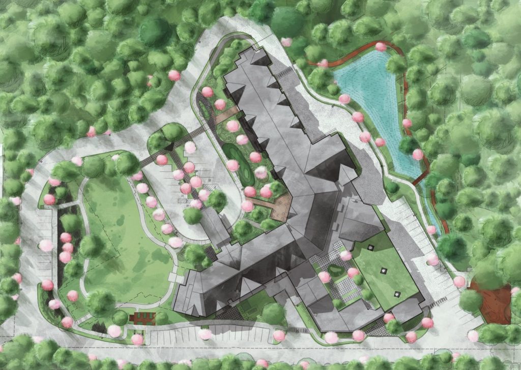
I Illustrated architectural map renderings with Adobe Photoshop and Illustrator for the Quail Park of Tukwila. During this process, I gained valuable training within a professional design process by achieving specific client needs, deadlines, and consultation skills. I aimed to create a map that had an artistic, yet intuitive design that could be used by both senior audiences and also within project proposals for the company.

01

Art

Here is just a quick collection of my drawn work, ranging from quick watercolor sketches to my first explorations of digital art!

Here is just a quick collection of my drawn work, ranging from quick watercolor sketches to my first explorations of digital art!