iDigest
iDigest is a mobile and web application spearheaded by GraceTech as a response to the technical needs of non-profit organizations. The app primarily provides quality discussion guides for class content, but also functions as an interface for group study communications.
The Challenge
WeChat, the popular Chinese messaging and social media app, has been steadily increasing its levels of censorship. Many organizations’ “Public Accounts” have been shut down due to posting content related to religious beliefs. Church organizations are now looking for alternatives, and our goal is to utilize iDigest’s current infrastructure and features to provide an effective solution.
Our high-level goals:
- Transform iDigest into a multi-organization, content-producing platform
- Develop features that appeal to all of our users: church members, organization leaders, content producers, and content-oriented users
My Role
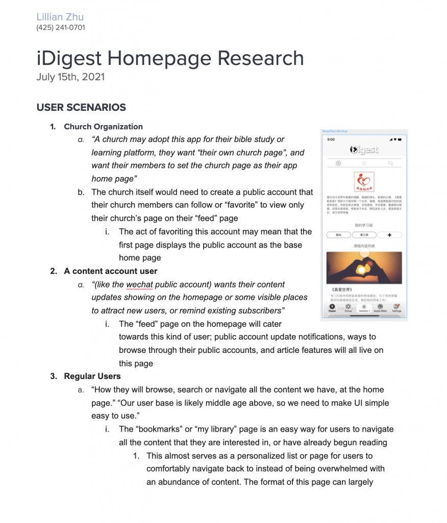
I was tasked with writing detailed feature specifications for implementing “Public Accounts” within iDigest, which involved restructuring the mobile app’s homepage. I worked alongside the team’s front-end developers and program manager.
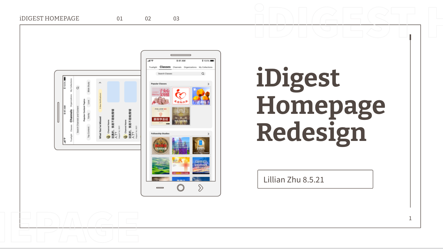
Once my written specifications were approved, I crafted a wireframe mockup using Figma and Adobe XD to help visualize and convey our ideas. Specific UX decisions were made after consulting with our team’s UX researcher, ensuring that the new features are intuitive to use by our older audience, and simple to develop.
I then presented my homepage redesign pitch to the CEO and then began implementing some of the new ideas onto the web app using React.
By the end of my internship, we successfully presented a prototype of a “Public Account” within iDigest to our church organization client.
The Process
First step = Research
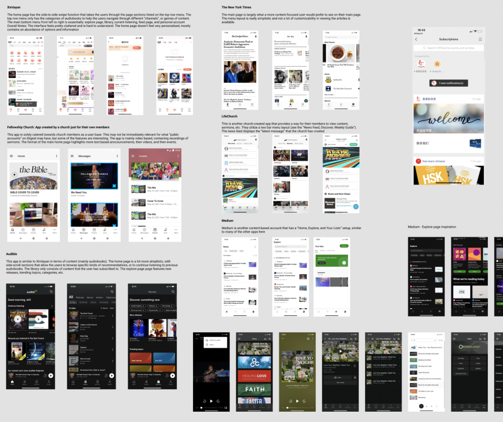
I conducted research within many other mobile applications that ranged from church-oriented content to news platforms like The New York Times. My goal was to piece together common features and page structures across a variety of different apps and audiences, so the new features within Digest’s new homepage could be easily used by an older audience.
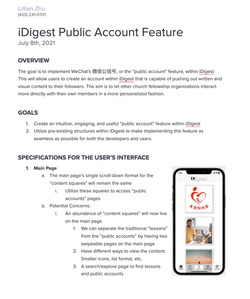
Specification
I began fleshing out our ideas for the new homepage by
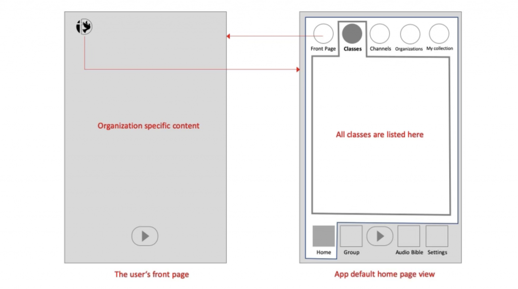
Scaffolding
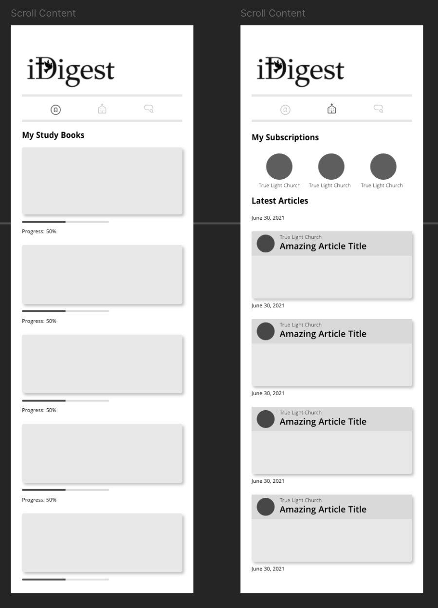
After discussion, we generated a basic homepage layout. This served as my foundation throughout the design process.
